 Dark Mode / Theme Dark Mode / Theme
|
5,671 views
|
|
|
|
|
|
Well done Karlos, looks and works decent 👌.
Now this is done and there's been a bit of rain, you should get down the river for a few 😀
|
|
|
|
In reply to Post #45
I'm going to bed, early night tonight...will check it out on old site tomorrow as you'll no doubt remind me!
Thanks for feedback / help testing etc today, to you and to others 👍 🙏
|
|
|
|
In reply to Post #43
Ooh, just showing off now, but 👏🏻👏🏻👏🏻
And dont forget to also fix it on old carpforum too 🥸
|
|
|
|
In reply to Post #43
Another one off the list, nice👍
|
|
|
|
In reply to Post #41
Quote: it would be good to return to a clickable link to the thread
Done 😎
|
|
|
|
In reply to Post #41

|
|
|
|
In reply to Post #40
Agree, not needed in who's online 😬
And dont forget, when you look who is online, it would be good to return to a clickable link to the thread as previously mentioned 🤓🤓🤓
|
|
|
|
In reply to Post #39
I could add them there, but everyone listed is with the 10min cut off...so everyone would be green or peachy.
I used to find the colours handy whilst surfing the Topics/Messages, just spotting if someone is/was recently online can be useful...only realised I had overlooked adding that once the site had gone live. Added now though, along with quite a few changes today
|
|
|
|
In reply to Post #38
Doh, I thought these coloured things were going to show in whos online 🙄
In the threads its all fine.

|
|
|
|
In reply to Post #35
The usernames on WhosOnline don't have the colours.
I can add them, but on that page you can see when they last clicked/viewed a page etc
I might add it though, I'll go review and make a knee jerk decision 😂
|
|
|
|
In reply to Post #36
I thought these colours were to show in who's online 🙄
In the treads its fine.
|
|
|
|
In reply to Post #35
How does it look in this or any other thread though?
Whos online shows arrival times and last active times so no colours there
On mobile long click chrome, click the little info icon, storage, clear cache.
This won't clear cookies or logon data etc.
|
|
|
|
In reply to Post #33
Logged out, cleared my chrome cache. This is what I've got. It's not important really.
 
|
|
|
|
In reply to Post #33
I'm not sure how to clean a browser cache on mobile, at least without clearing cache for all sites (meaning cookies gone and logged out everywhere 😡)
On PC you can Control-F5 in your browser to force the refresh.
I might be able to tweak the code to force a CSS refresh, I'll try now - I had a go, hopefully that will have helped!? 🙏
|
|
|
|
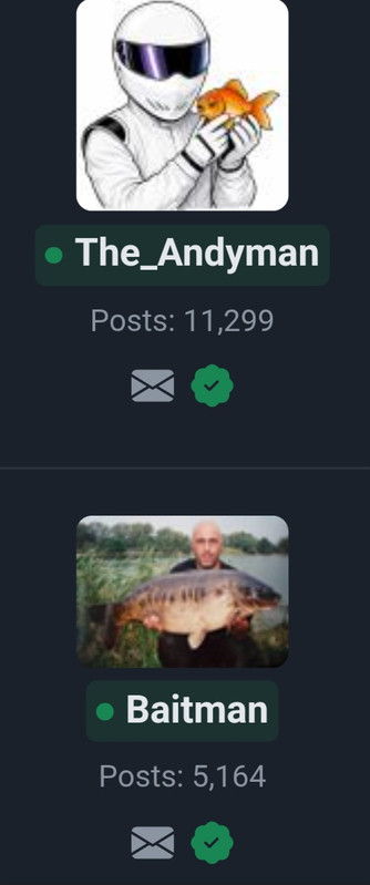
This is how it looks
Edit - and as time passes with no activity
|
|
|
|
In reply to Post #31
May be worth clearing your browser cache
|
|
|
|
In reply to Post #29
No coloured dots or boxes for me, light and dark modes the same.
|
|
|
|
In reply to Post #29
And the coloured box around the name
|
|
|
|
In reply to Post #28
Sorry, I've just twigged what you mean.
Usernames now have a little coloured dot next to them, i think it's the dot that changes colour
|
|
|
|
In reply to Post #27
all user names are black in normal, and white in dark mode.
The profile pics are ok.
|
|
|
|
In reply to Post #26
I just added some edits but just so you don't miss them, is it the names or their profile pics?
|
|
|
|
In reply to Post #25
Chrome on android mobile.
|
|
|
|
In reply to Post #24
Out of interest, what browser do you use?
I'm using chrome on phone and tablet and all looks ok in both modes to me.
In fact i really like dark mode on the tablet, I'll stick with it for now 👍
Is it the names or the pics that are black? I've just noticed that most profiles now have no pictures showing when looking at who's online
|
|
|
|
In reply to Post #23
On dark and normal, all user names are black in normal, and white in dark mode.
|
|
|
|
In reply to Post #22
Thank you, fixed.
I was updating Profile panel so online usernames are peachy/greeny (online within 10mins/5mins)
Used to have it on old site, now on new site.
|
|
|
|
|
|
|
In reply to Post #20
Thanks mate, lots of tweaks to do to get it nearer to perfect, but now I have put my programming hat back on hopefully I can get some new features written.
As you may/not remember I used to work for Friday-Ad many moons ago, a classified advertising paper...and as Development Manager I wrote/oversaw the programming team - so I am thinking of creating a proper Classified part to the site with image upload by the user, possibly a library of stock photos in case you want to use them (they would of course be labelled as a stock photo) and also make it searchable by keyword and browsable by brand/make or by genre.
There's quite a few tackle trading sites out there and whilst they serve a purpose they've never really excited me.
Also, a venues section. I wrote it 25+ years ago for the UK but dropped it when I let my original website (www.UKCarp.net) fade away when CarpForum was born. Venues for info (don't worry Wandle, not for booking a'la Swimbooker)
|
|
|
|
|
The new site looks the nuts mate, awesome work 😎
|
|
|
|
In reply to Post #18
Thanks.
Most pages are actually faster now, I optimised a lot of the SQL so that multiple functions per page were done in one call.
Feel free to send in any ideas for features you want. It's only once every 25years I am in the mood for doing some programming 😉
Image upload is already on the ToDo list 👍
|
|
|
|
|
Compliments, looking very good, still fast af, here's to another couple of decades:)
|
|
|
|
In reply to Post #16
You can still use the old site to get to old PMs.
You can even use it to read and write topics/messages still, basically we now have 2 different websites running off of the same database
LINKY POO™ http://old.carpforum.co.uk/
The only section of the site which is not forwards/backwards compatible is the PM system. The new PM system is far superior as you'll see once you get used to it. No need for a sent box as your PM conversation is basically a 2 person topic.
Anyone needs to see it, send me a PM asking for a reply....or tell me what you DON'T like about the new styling and I will see if I can make it better for you.
|
|
|
|
That was weird, one minute I was on the old site and suddenly, boom, it's disappeared and I'm on the new one!!
Liking it especially dark mode 👍
One question, is there any way to get your PM inbox back or is it lost in the ether?
|
|
|
|
In reply to Post #14
Checking up on old threads to see if there are any features requested that I have not yet written into the new site.
As you know (having had a sneaky pre-launch peek at the new site) Dark Mode is in place AND a whole new/better PM system 👍😎
|
|
|
|
In reply to Post #13
It would be helpful to check back on previous pm messages, an in box and out box.
|
|
|
|
In reply to Post #11
Yeah, which is why the task has never been done before...I have either been too busy fishing, shooting or getting divorced (depending which era of the last 25 years we look at  ) )
I've been wanting to do it all that time but never had the motivation.
If ANY users of the site have any ideas of
a) what would be a better way to do things on here
b) bits to hide / demote as they are used so infrequently
c) new feature ideas (e.g. favourite Topics can be a list or dropdown on the homepage...which is something I sort of added a while back, but they only show when there's a new post in that Topic)
d) etc etc
|
|
|
|
In reply to Post #10
Yes mate, if I don't fish tonight I might get the Topic list and Message pages sketched out, see how they look.
Also that page was a quick draft so needs to be tidied up and space used better
e.g. I don't need loads of space wasted with the big wording across the centre "CarpForum - The UK Carp Fishing Forum" and I should get a proper logo in place rather than the lift'n'shift use of the current one with nasty rectangular background.
The site will continue to run in it's current form, but new versions of pages will hopefully be developed quite quickly and run in parallel for anyone wishing to use the new design.
I need to question everything that's currently shown, I think there will be lots of little icons/options rendered (for example icons in the profile box to the left of this message) which RARELY get used. I can still make the options available but in a neater more modern way.
View profile could be under the users profile pic (which could be top right for example) and once you click it you go to your profile and there are options to edit it, change password, turn off mailing list etc etc (btw, some trivia in 25 years of the site running I have never sent out a single email to the mailing list...)
|
|
|
|
In reply to Post #9
Ok Karlos, if you are happy to do it 
I just think people should know or remember that this site is your creation and when they ask for things that they should consider it's you that will do it. It's not going to be handed to some corporate faceless development team to do.
|
|
|
|
In reply to Post #6
Responsive view for that page looks good on the mobile, but need to see threads and posts to really tell
|
|
|
|
In reply to Post #8
The plan is to have both.
The current site is already written/done, so I can leave that in place...and then anyone who wants the more mobile friendly site can opt to use that site instead.
|
|
|
|
I don't like change.
I like things as they are.
|
|
|
|
In reply to Post #6
Me likey, much easier on the eyes lying in bed in the dark
|
|
|
|
So, maybe it's time I re-wrote the site, certainly the layout.
It's not very mobile friendly (sorry!)
I am happy to do this and have in fact just had a very quick bash at doing a responsive (as it's called in development circles) page which will respond (as the name suggests) to different screen widths.
Also, top right is a dark mode button 
Take a look...
LINKY POO™ https://www.carpforum.co.uk/Shared/New2.asp
|
|
|
|
In reply to Post #4
DARK MODE...
|
|
|
|
In reply to Post #1
Got to admit my phones in dark mode all the time when searching and if available on sites. I hate glare even on the lowest setting in the dark, I find it gives me eye strain even on the lowest brightness setting with adaptive turned off...to the point I have to turn it off as my eyes start weeping.
|
|
|
|
In reply to Post #1
Can we have a dark mode please 
The phone is far too bright in the bivvy after midnight 
|
|
|
|
In reply to Post #1
For iPhone (if anyone is wondering) you can put it in reader that works
|
|
|
|
Sorry if this has been suggested, I couldn't find anything with the search function.
Is it possible to have a dark mode for the forum?
I often browse using my phone in the evening.
Unless someone knows of an alternative way, I have a Google Pixel 5, the settings are already on Dark Mode which works for apps etc.
Cheers ,
Harrison
|
|

